Colour and Culture: Understanding 2020-2026 Through Pantone’s Lens
The announcement of Pantone’s Colour of the Year always sparks conversation, but Cloud Dancer has brought a different kind of discussion; one that goes beyond design trends and taps into how colour intersects with culture, identity and lived experience. Colours are all associated with many things throughout time and these also shift and change. “The Secret Lives of Colour” by Kassia St Clair gives a fascinating history of the cultural meaning and practicalities of white as it applies to art, religion and history. She animatedly discusses the contradictory relationship humans have with the colour White; describing even Herman Melville’s classic tale of Moby Dick as a “veritable homily on the troubling, bisected symbolism of this colour”.
So why did they choose white as the colour of the year. Well, let’s start with how Pantone’s Colour Institute choose the colour for the year. They actually spend the whole year analysing:
global cultural mood
social patterns (stress, hope, resilience, activism, uncertainty)
economic shifts
fashion, interiors, design shows
technology trends
materials and manufacturing innovations
entertainment and media
lifestyle shifts (e.g. slowing down, going digital, etc.)
They then select a colour that represents the mood or direction of culture, it’s not a colour that is “better,” “superior,” “more important,” or “recommended” over others. It’s just symbolic, not prescriptive. For some context I looked up the last 5 years or so of colours Pantone chose and why. This sequence shows a world cycling through shock, adaptation, expression, rest and reconnection.
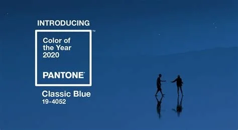
2020 - Classic Blue (19-4052)
Global mood: A world entering a new decade marked by uncertainty - political division, climate anxiety, rising digital overload, and a widespread desire for stability.
Colour meaning: Classic Blue offered a calm, dependable anchor. It symbolised clarity, trust and the need for steadiness. In hindsight, it became unexpectedly prescient: a grounding presence ahead of a globally destabilising year.
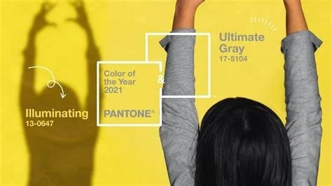
2021 - Ultimate Gray (17-5104) & Illuminating (13-0647)
Global mood: Mid-pandemic realities - loss, resilience, rebuilding, and searching for hope after a collective shock. Society was exhausted yet holding onto the belief that things could improve.
Colour meaning: A dual selection for the first time in years: grey for strength and endurance; yellow for optimism and uplift. Together, they captured a world balancing grief with hope, and the idea that community resilience matters.
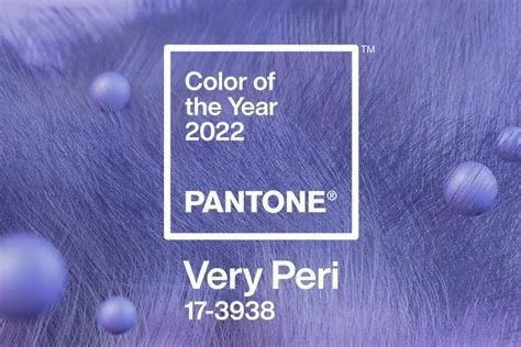
2022 - Very Peri (17-3938)
Global mood: Re-emergence. Transformation. The acceleration of digital life. People reconsidered work, identity, creativity and the boundaries between online and offline worlds.
Colour meaning: A brand-new colour created by Pantone - symbolising reinvention, curiosity and digital-meets-physical possibility. Very Peri represented creative courage and a willingness to imagine new ways of living.
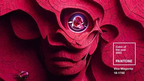
2023 - Viva Magenta (18-1750)
Global mood: A cultural push toward expression, experimentation and reclaiming vitality after years of restriction. A rise in maximalism, self-reinvention and bold identities.
Colour meaning: A powerful, nature-rooted red that embodied confidence, joy and the human spirit. Viva Magenta encouraged a return to exuberance, vibrancy and a fuller emotional register.
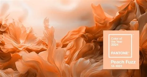
2024 - Peach Fuzz (13-1023)
Global mood: Widespread burnout and a craving for softness, compassion and emotional safety. A shift toward slower living, meaningful relationships and gentle environments.
Colour meaning: A warm, tactile peach tone chosen for its nurturing quality. It expressed the need for kindness - in design, in community, and within ourselves - and reflected the growing cultural value placed on comfort and care.
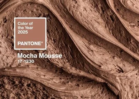
2025 - Mocha Mousse (17-1230)
Global mood: A search for grounding during rapid technological, economic and social change. People gravitated toward sensory experiences, ritual, and the comfort of the real and tactile.
Colour meaning: A mellow, earthy brown symbolising warmth, nourishment and connection. Mocha Mousse captured a collective desire to return to something steady, familiar and human. It feels like home base - warm, stabilising, gentle.
So while Pantone’s selection process is based on global mood forecasting and not on cultural interpretations, the reactions to the 2026 colour “Cloud Dancer” remind us of something important: colours don’t exist in a vacuum. They carry history, meaning and associations that shift depending on who is looking at them and from where they stand.
PANTONE 11-4201 Cloud Dancer, a soft, billowy white that Pantone’s color team chose because, frankly, the world is exhausted. “We're looking for respite, looking for relief, emotional disconnection, overstimulation from visuals,” says Laurie Pressman, Vice President of the Pantone Color Institute. “We just want to step back.” Elle Decor
Rather than dismissing the criticism or defending the choice, I think there’s value in pausing here.
When I reflect, Cloud Dancer becomes less about the colour itself and more about what this moment, and the discussion around it, is highlighting; that designers and creatives and communicators have a responsibility to stay aware, to listen and to consider the broader lens through which our work is received. This year’s colour invites a conversation about space: the space we create in our work for inclusivity, the space we hold for voices that haven’t historically been featured and the space we’re asked to imagine when design choices land differently across communities.
Whilst the intention may have been simply for Cloud Dancer to symbolise calm, peace and clarity, it also arrives in a world that is looking for hope, desperate for empathy and for all of us to be more thoughtful about the stories we reinforce, even unintentionally.
It’s a reminder that design isn’t just aesthetics.
It has to thoughtfully consider context, culture and care.


